Graph shows how close Leamington, Warwick and Kenilworth came to being in a 'lower' Covid tier - which gives us hope for a change at the next review
and live on Freeview channel 276
Health chiefs have shared data showing how close Warwickshire was to being placed in Tier Two lockdown restrictions this week, rather than the highest tier.
Council leaders in the county say that the data shows there is a chance Warwickshire could move down into Tier Two at the next review in two weeks - but people will need to stick to the rules.
Advertisement
Hide AdAdvertisement
Hide AdThe Government announced on Thursday (November 26) what tiered restrictions each county in England will be under when the national lockdown is lifted on December 2.

Warwickshire was placed in Tier Three, the highest tier possible - much to the anger of council leaders and MPs, who argue that the whole county has been unfairly lumped together, given that rates are lower in our part of the county.
Now, a new data set has shown how Warwickshire compares to other counties in England and indicates how close its residents were to entering the middle tier - Tier Two.
The scatter graph shows how the county is towards the 'lower range' of areas that were designated Tier Three.
Advertisement
Hide AdAdvertisement
Hide AdWhile it is not the only system that was used to decide tiers, the data breaks down on average where some counties in different tiers rank next to one another based on the severity of their infection rate.
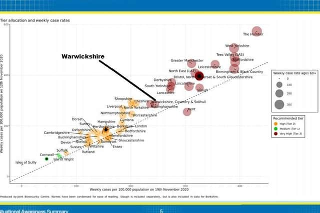
In layman terms, the further to the top right a county places, the more likely they are to be placed in Tier Three.
The graph compares each county's weekly cases per 100,000 population on November 12 and November 19 to gauge how severely the infection rate has grown or shrunk.